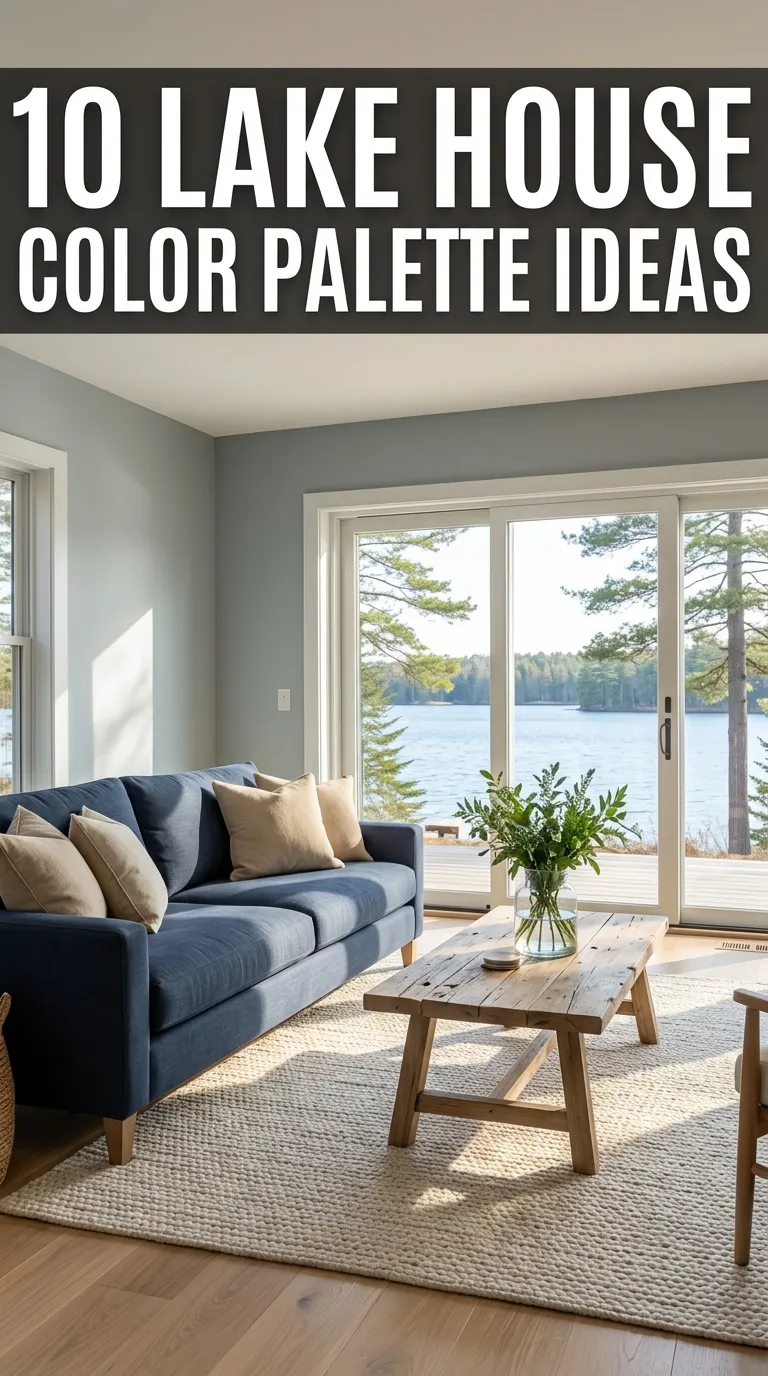
10 Lake House Color Palette Ideas
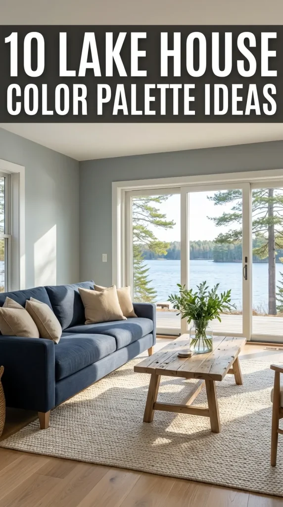
A lake house is more than just a getaway—it is a place where life slows down, where nature sets the rhythm, and where interiors are meant to feel restorative rather than overstimulating. The most successful lake house interiors don’t compete with the surroundings; they echo them. And nothing influences this connection more than the color palette.
A thoughtfully chosen lake house color palette creates harmony between indoors and outdoors. It reflects water, sky, trees, stone, sand, and light—helping interiors feel grounded, peaceful, and timeless. Unlike urban or trend-driven homes, lake houses benefit from palettes that are soft, natural, and enduring.
Color in a lake house should never feel loud or forced. Instead, it should create a sense of flow—rooms blending into one another, textures replacing bold contrasts, and light gently moving across surfaces. Whether the style is rustic, modern, coastal, or traditional, the right palette enhances comfort, warmth, and longevity.
This article explores 10 lake house color palette ideas, each explained in depth with guidance on mood, balance, materials, and how the colors work together. These palettes are designed to feel calm in every season—cool and refreshing in summer, warm and cozy in fall and winter—making your lake house a true year-round retreat.
1. Soft Blue, Warm White, and Natural Wood
This is one of the most classic and beloved lake house color palettes—and for good reason. Soft blue reflects the water and sky, warm white adds brightness, and natural wood grounds the space.
Soft blues work best when muted rather than bold. Think powder blue, misty blue, or pale denim. These shades feel calm and expansive without becoming nautical or cold. Warm white on walls and ceilings keeps interiors bright while avoiding starkness.
Natural wood—whether light oak, pine, or weathered finishes—adds warmth and texture. This palette feels open, breezy, and timeless, making it ideal for main living areas and bedrooms.
It’s perfect for lake houses that emphasize views, natural light, and relaxed living.
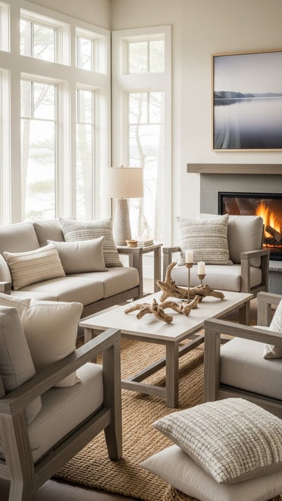
2. Sand, Cream, and Driftwood Grey
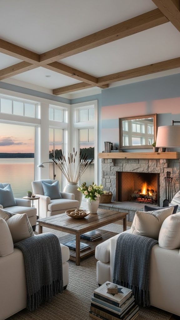
Inspired by shoreline textures, this palette feels soft, grounded, and effortlessly calming. Sand and cream tones create warmth, while driftwood grey introduces subtle contrast.
Sand-colored walls or textiles feel cozy without heaviness. Cream softens the palette and reflects light beautifully. Driftwood grey—used in furniture, beams, or accents—adds depth and a weathered, lakeside character.
This palette works especially well in rustic or transitional lake houses. It feels neutral yet rich, allowing natural materials like stone, linen, and wood to shine.
The result is an interior that feels peaceful, welcoming, and quietly sophisticated.
3. Forest Green, Warm Beige, and Soft Black Accents
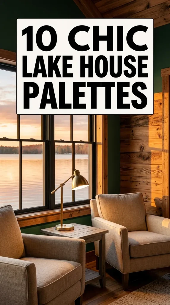
For lake houses surrounded by trees, forest green creates a strong connection to the landscape. When balanced with warm beige and subtle black accents, it feels elegant rather than heavy.
Forest green works beautifully on accent walls, cabinetry, or upholstery. Beige keeps the palette soft and livable, preventing the green from dominating the space.
Soft black—used sparingly in lighting, hardware, or window frames—adds structure and definition without harsh contrast.
This palette feels grounded, cozy, and perfect for year-round lake homes, especially those used in fall and winter.

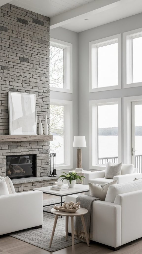
4. Light Grey, White, and Stone Tones
This palette is ideal for modern or minimalist lake houses. Light grey provides subtle contrast to white while maintaining a calm, airy feel.
White keeps the space bright and open, while light grey adds softness and depth. Stone tones—beige, taupe, or soft charcoal—introduce natural texture and warmth.
This palette works beautifully with concrete, stone fireplaces, and large windows. It feels clean and contemporary while still being warm enough for a retreat setting.
Perfect for lake houses that lean modern but still value comfort and serenity.
5. Muted Blue-Green, Linen White, and Aged Brass
Blue-green shades—such as sage teal, duck egg, or soft seafoam—bridge the gap between water and foliage. These hues feel soothing, layered, and sophisticated.
Paired with linen white, the palette remains light and breathable. Aged brass accents add warmth and subtle elegance, especially in lighting and hardware.
This palette feels slightly refined yet relaxed, making it ideal for lake houses that blend coastal and traditional influences.
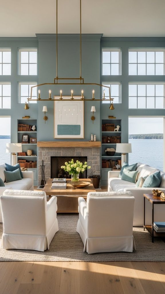
It creates an interior that feels thoughtful, timeless, and gently luxurious.
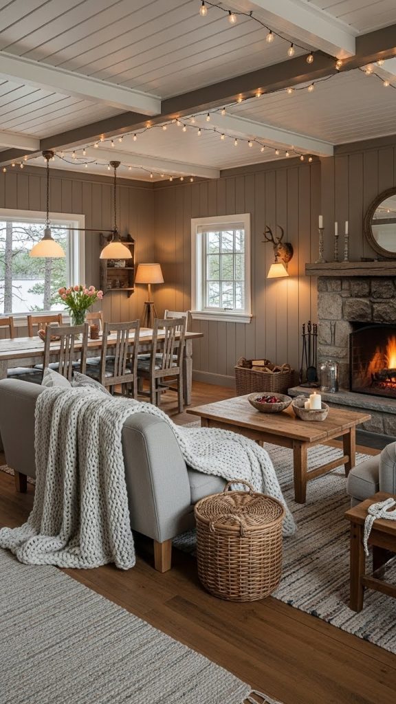
6. Warm Taupe, Soft White, and Weathered Wood
Taupe is one of the most versatile colors for lake houses. Neither too cool nor too warm, it creates a neutral backdrop that adapts to changing light and seasons.
Soft white keeps the palette fresh, while weathered wood introduces character and authenticity. This combination feels cozy without being dark and neutral without being boring.
It works especially well in cabins or lake houses with exposed beams, plank walls, or vintage furniture.
This palette creates a comforting, lived-in feel that invites relaxation and long stays.
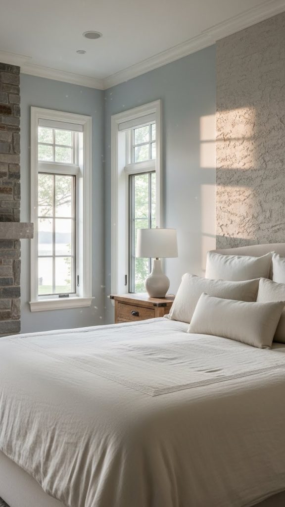
7. Pale Blue-Gray, Cream, and Natural Stone
This palette feels cool, quiet, and refined—perfect for lake houses with expansive water views.
Pale blue-gray mirrors the lake on overcast days, creating continuity between indoors and outdoors. Cream softens the cool tones and adds warmth.
Natural stone—used in fireplaces, floors, or accents—anchors the palette and adds texture.
This color scheme feels elegant, calm, and especially suited to bedrooms and reading spaces.
8. Earthy Brown, Moss Green, and Off-White
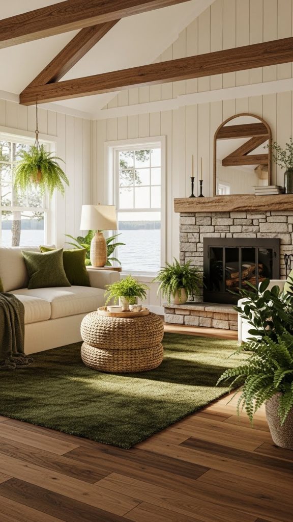
This palette draws inspiration directly from the forest floor. Earthy browns add warmth, moss green brings freshness, and off-white balances the depth.
Brown is best used in wood finishes, leather, or textiles. Moss green works beautifully in upholstery or accent walls. Off-white keeps the palette from feeling too dark.
This combination feels deeply grounding and ideal for lake houses meant to feel cozy and secluded.
It’s especially effective in colder climates or wooded settings.
9. White, Light Wood, and Subtle Blue Accents
For those who love simplicity and brightness, this palette offers a fresh take on lake living.
White dominates the space, making rooms feel open and airy. Light wood adds warmth and texture. Subtle blue accents—used sparingly in cushions, art, or ceramics—add just enough color to reference the lake.
This palette is perfect for small lake houses or spaces with limited natural light.
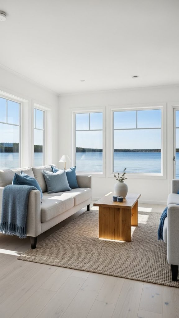
It feels effortless, modern, and timeless.
10. Greige, Soft Green, and Warm Charcoal
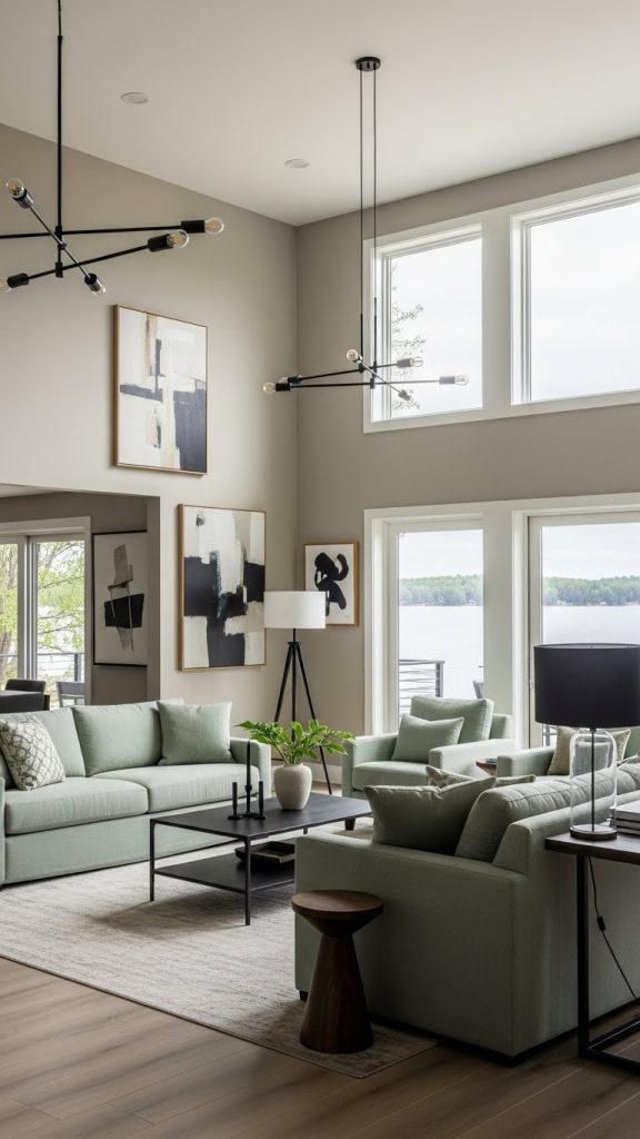
Greige—a blend of grey and beige—is ideal for lake houses because it adapts beautifully to natural light. It feels calm, neutral, and warm.
Soft green adds a subtle natural element, while warm charcoal introduces depth and contrast without harshness.
This palette works well across open floor plans, helping different rooms flow together seamlessly.
It feels balanced, modern, and perfect for homeowners who want neutrality with character.
How to Use Color Successfully in a Lake House
- Let nature guide your palette
- Favor muted over saturated colors
- Use texture to add depth instead of contrast
- Keep transitions soft between rooms
- Choose colors that feel good in all seasons
Lake house color palettes should feel restful, timeless, and connected to place.
Conclusion
A lake house color palette sets the emotional tone of the entire home. It influences how spaces feel at sunrise and sunset, in summer heat and winter quiet. The best palettes don’t shout—they whisper calm.
The ten lake house color palette ideas explored in this guide show how color can reflect water, trees, stone, and sky while remaining warm, livable, and enduring. Whether your style leans rustic, modern, coastal, or classic, the right palette creates harmony between your home and its surroundings.
Ultimately, a well-chosen lake house color palette doesn’t just decorate a space—it deepens the experience of being there.